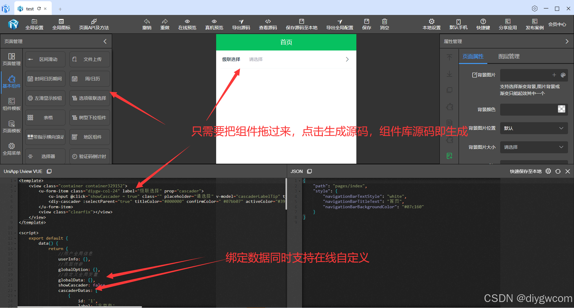
低代码可视化-UniApp Cascader级联选择器-代码生成器
Cascader级联选择器是一种常用的UI组件,特别适用于需要从一组相关联的数据集合中进行选择的情况,如省市区选择、公司层级选择、事物分类等。Cascader级联选择器通过分组多列进行展示,选项需要有一定的逻辑顺序,从集合到单项进行选择,且最好是符合用户认知模型的集合方式。整体需包含两个及两个以上的层级,与输入框连用,以下拉菜单承载。它常用于单选,但也可支持多选(取决于具体实现)
·
Cascader级联选择器是一种常用的UI组件,特别适用于需要从一组相关联的数据集合中进行选择的情况,如省市区选择、公司层级选择、事物分类等。以下是对Cascader级联选择器的详细介绍:
一、基本概念
Cascader级联选择器通过分组多列进行展示,选项需要有一定的逻辑顺序,从集合到单项进行选择,且最好是符合用户认知模型的集合方式。整体需包含两个及两个以上的层级,与输入框连用,以下拉菜单承载。它常用于单选,但也可支持多选(取决于具体实现)。
二、功能特点
- 多级分类:可以将一个较大的数据集合通过多级分类进行分隔,方便用户进行选择。
- 联动选择:当用户选择某一级选项时,下一级选项会随之变化,实现联动效果。
- 搜索与过滤:部分Cascader级联选择器支持在输入框中输入文字进行模糊查询,快速定位所需选项。
三、使用场景
Cascader级联选择器适用于需要从一组具有层级关系的数据中进行选择的情况。例如,在电商平台的收货地址选择中,用户需要依次选择省、市、区/县等地址信息;在企业内部系统中,员工需要选择所属部门时,也需要通过级联选择器依次选择公司、部门、小组等层级信息。
四、组件实现
<template>
	<view class="u-select">
		<u-popup :blur="blur" :maskCloseAble="maskCloseAble" mode="bottom" :popup="false" v-model="popupValue"
			length="auto" :safeAreaInsetBottom="safeAreaInsetBottom" @close="close" :z-index="uZIndex">
			<view class="u-select" :style="{'--active-color':confirmColor}">
				<view class="u-select__header" @touchmove.stop.prevent="">
					<view class="u-select__header__cancel u-select__header__btn" :style="{ color: cancelColor }"
						hover-class="u-hover-class" :hover-stay-time="150" @tap="close">
						{{cancelText}}
					</view>
					<view class="u-select__header__title">
						{{title}}
					</view>
					<view class="u-select__header__confirm u-select__header__btn"
						:style="{ color: moving ? cancelColor : confirmColor }" hover-class="u-hover-class"
						:hover-stay-time="150" @touchmove.stop="" @tap.stop="confirm">
						{{confirmText}}
					</view>
				</view>
				<view class="u-select__body">
					<view class="diy-cascader">
						<view class="diy-cascader__header">
							<view class="diy-cascader__tabs">
								<view v-for="(tab, index) in tabs" :key="index" class="diy-cascader__tab"
									:class="{ 'diy-cascader__tab--active': index === activeTab }"
									@tap="onClickTab(index)">
									<text class="diy-cascader__tab-text">{{ tab }}</text>
									<text v-if="index === activeTab" class="diy-cascader__tab-line"></text>
								</view>
							</view>
						</view>
						<swiper class="diy-cascader__content" :current="activeTab" @change="onSwiperChange">
							<swiper-item v-for="(list, tabIndex) in listList" :key="tabIndex"
								class="diy-cascader__swiper-item">
								<scroll-view scroll-y class="diy-cascader__scroll">
									<view class="diy-cascader__list">
										<view v-for="option in list" :key="option.value" class="diy-cascader__option"
											:class="{ 'diy-cascader__option--selected': isSelected(option, tabIndex) }"
											@tap="onSelect(option, tabIndex)">
											<text class="diy-cascader__option-text">{{ option[labelName] }}</text>
											<text v-if="isSelected(option, tabIndex)" class="diy-cascader__option-icon">
												<text class="diy-icon diy-icon-success"></text>
											</text>
										</view>
									</view>
								</scroll-view>
							</swiper-item>
						</swiper>
					</view>
				</view>
			</view>
		</u-popup>
	</view>
</template>

<script>
	import Emitter from "../../libs/util/emitter.js";
	export default {
		mixins: [Emitter],
		emits: ["update:modelValue", "confirm", "change", "finish"],
		props: {
			// 通过双向绑定控制组件的弹出与收起
			modelValue: {
				type: Boolean,
				default: false
			},
			// "取消"按钮的颜色
			cancelColor: {
				type: String,
				default: '#606266'
			},
			// "确定"按钮的颜色
			confirmColor: {
				type: String,
				default: '#19be6b'
			},
			// 弹出的z-index值
			zIndex: {
				type: [String, Number],
				default: 0
			},
			safeAreaInsetBottom: {
				type: Boolean,
				default: false
			},
			// 是否允许通过点击遮罩关闭Picker
			maskCloseAble: {
				type: Boolean,
				default: true
			},
			// 默认选中值
			defaultValue: {
				type: Array,
				default () {
					return [];
				}
			},
			// 自定义value属性名
			valueName: {
				type: String,
				default: 'id'
			},
			// 自定义label属性名
			labelName: {
				type: String,
				default: 'label'
			},
			// 自定义多列联动模式的children属性名
			childName: {
				type: String,
				default: 'children'
			},
			// 顶部标题
			title: {
				type: String,
				default: ''
			},
			// 取消按钮的文字
			cancelText: {
				type: String,
				default: '取消'
			},
			// 确认按钮的文字
			confirmText: {
				type: String,
				default: '确认'
			},
			// 遮罩的模糊度
			blur: {
				type: [Number, String],
				default: 0
			},
			// 树型结构值
			list: {
				type: Array,
				default: () => []
			},
			//提示选择
			placeholder: {
				type: String,
				default: '请选择'
			},
			//是否允许只选父
			selectParent: {
				type: Boolean,
				default: true
			},
			allPlaceholder: {
				type: String,
				default: '请选择完整路径'
			}
		},
		data() {
			return {
				isFinish: false,
				activeTab: 0,
				selectedList: [],
				listList: [],
				tabs: [],
				popupValue: false,
				// 列是否还在滑动中,微信小程序如果在滑动中就点确定,结果可能不准确
				moving: false,
				uForm: {
					inputAlign: "",
					clearable: ""
				}
			};
		},
		watch: {
			// 在select弹起的时候,重新初始化所有数据
			defaultValue: {
				immediate: true,
				handler(val) {
					if (val) setTimeout(() => this.initSelection(), 10);
				}
			},
			modelValue: {
				immediate: true,
				handler(val) {
					if (val) setTimeout(() => this.initSelection(), 10);
					this.popupValue = val;
				}
			},
			list: {
				handler(val) {
					this.initList()
				},
				immediate: true
			}
		},
		mounted() {
			let parent = this.$u.$parent.call(this, 'u-form');
			if (parent) {
				Object.keys(this.uForm).map(key => {
					this.uForm[key] = parent[key];
				});
			}
		},
		computed: {
			uZIndex() {
				// 如果用户有传递z-index值,优先使用
				return this.zIndex ? this.zIndex : this.$u.zIndex.popup;
			},
		},
		methods: {
			initSelection() {
				//如果不为0表示已经选择过
				if (this.selectedList.length != 0) {
					return;
				}
				if (!this.defaultValue || !this.defaultValue.length) {
					this.selectedList = []
					return
				}

				let currentList = this.list
				const selected = []

				for (const value of this.defaultValue) {
					const option = currentList.find(item => item[this.valueName] === value)
					if (option) {
						selected.push(option)
						currentList = option.children || []
					}
				}

				this.selectedList = selected
				this.updateTabs()
				this.updateListList()
			},
			initList() {
				this.listList = [this.list]
				this.updateTabs()
			},
			updateTabs() {
				const tabs = []
				let index = 0

				this.selectedList.forEach(option => {
					tabs.push(option[this.labelName])
					index++
				})

				if ((index === 0 || this.selectedList[index - 1]?.children?.length)) {
					tabs.push('请选择')
				}

				this.tabs = tabs
			},
			updateListList() {
				this.listList = [this.list]

				this.selectedList.forEach((option, index) => {
					if (option.children) {
						this.listList[index + 1] = option.children
					}
				})
			},
			isSelected(option, tabIndex) {
				if (!this.selectedList[tabIndex]) {
					return false
				}
				return this.selectedList[tabIndex][this.valueName] === option[this.valueName]
			},
			onSelect(option, tabIndex) {
				this.selectedList = this.selectedList.slice(0, tabIndex)
				this.selectedList.push(option)

				this.updateTabs()
				this.updateListList()

				if (!option.children || option.children.length == 0) {
					this.isFinish = true;
					this.$emit('finish', {
						value: this.selectedList.map(opt => opt[this.valueName]),
						tabIndex,
						selectedList: [...this.selectedList]
					})
				} else {
					this.isFinish = false;
					this.activeTab = tabIndex + 1
				}
				this.$emit('change', this.selectedList)
				// this.$emit('input', this.selectedList.map(opt => opt[this.valueName]))
				// this.$emit('change', {
				// 	value: this.selectedList.map(opt => opt[this.valueName]),
				// 	tabIndex,
				// 	selectedList: [...this.selectedList]
				// })
			},
			onClickTab(index) {
				this.activeTab = index
			},
			onSwiperChange(e) {
				this.activeTab = e.detail.current
			},
			//点击取消按钮触发
			close() {
				this.$emit("update:modelValue", false);
			},
			//提交触发
			confirm(flag) {
				//判断是否必须整条路径
				if (!this.isFinish && !this.selectParent) {
					uni.showToast({
						title: this.allPlaceholder,
						icon: 'none'
					})
					return;
				}
				this.$emit("update:modelValue", false);
				this.$emit('confirm', this.selectedList)
				// 将当前的值发送到 u-form-item 进行校验
				this.dispatch("u-form-item", "onFieldChange", this.selectedList.map(opt => opt[this.valueName]));
			}
		}
	};
</script>

<style scoped lang="scss">
	@import "../../libs/css/style.components.scss";

	.u-select {

		&__action {
			position: relative;
			line-height: $u-form-item-height;
			height: $u-form-item-height;

			&__icon {
				position: absolute;
				right: 20rpx;
				top: 50%;
				transition: transform .4s;
				transform: translateY(-50%);
				z-index: 1;

				&--reverse {
					transform: rotate(-180deg) translateY(50%);
				}
			}
		}

		&__hader {
			&__title {
				color: $u-content-color;
			}
		}

		&--border {
			border-radius: 6rpx;
			border-radius: 4px;
			border: 1px solid $u-form-item-border-color;
		}

		&__header {
			@include vue-flex;
			align-items: center;
			justify-content: space-between;
			height: 80rpx;
			padding: 0 40rpx;
		}

		&__body {
			width: 100%;
			height: 650rpx;
			overflow: hidden;
			background-color: #fff;
			padding: 0 30rpx;


			.diy-cascader {
				background-color: #fff;
				height: 100%;

				&__tabs {
					display: flex;
					position: relative;
					border-bottom: 2rpx solid #ebedf0;
				}

				&__tab {
					display: flex;
					align-items: center;
					justify-content: center;
					padding: 0 12rpx;
					position: relative;
					color: #969799;
					font-size: 28rpx;
					line-height: 80rpx;

					&--active {
						color: var(--active-color, #1989fa);
						font-weight: 500;
					}
				}

				&__tab-text {
					position: relative;
					display: inline-block;
					word-break: keep-all;
				}

				&__tab-line {
					position: absolute;
					bottom: -2rpx;
					left: 50%;
					width: 64rpx;
					height: 6rpx;
					background-color: var(--active-color, #1989fa);
					border-radius: 6rpx;
					transform: translateX(-50%);
				}

				&__content {
					height: 550rpx;
				}

				&__scroll {
					height: 550rpx;
				}

				&__option {
					display: flex;
					align-items: center;
					justify-content: space-between;
					padding: 24rpx 0;
					color: #323233;
					font-size: 28rpx;
					line-height: 40rpx;

					&--selected {
						color: var(--active-color, #1989fa);
						font-weight: 500;
					}
				}

				&__option-text {
					flex: 1;
				}

				&__option-icon {
					color: var(--active-color, #1989fa);
					font-size: 32rpx;
					margin-left: 8rpx;
				}
			}

			.diy-icon-success::before {
				content: "✓";
			}
		}
	}
</style>
五、组件调用
<template>
<view class="container container329152">
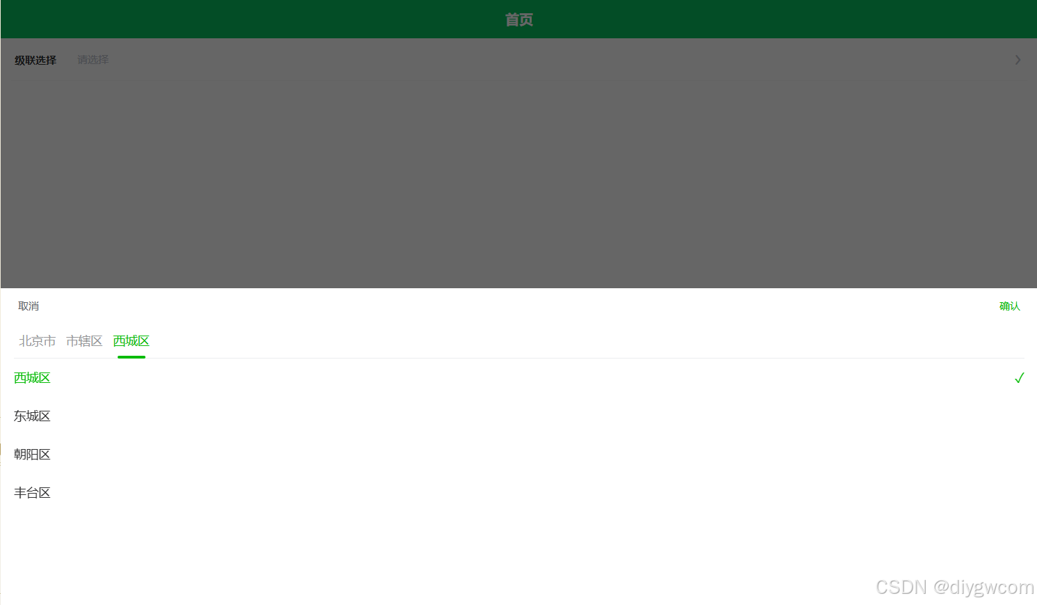
<u-form-item class="diygw-col-24" label="级联选择" prop="cascader">
<u-input @click="showCascader = true" class="" placeholder="请选择" v-model="cascaderLabelTip" type="select"></u-input>
<diy-cascader :selectParent="true" titleColor="#000000" confirmColor=" #07bb07" activeColor="#39b54a" valueName="id" labelName="label" :list="cascaderDatas" v-model="showCascader" @confirm="changeCascader"></diy-cascader>
</u-form-item>
<view class="clearfix"></view>
</view>
</template>
<script>
export default {
data() {
return {
//用户全局信息
userInfo: {},
//页面传参
globalOption: {},
//自定义全局变量
globalData: {},
showCascader: false,
cascaderDatas: [
{
id: '1',
label: '北京市',
open: true,
children: [
{
id: '11',
label: '市辖区',
open: true,
children: [
{ id: 111, label: '西城区' },
{ id: 112, label: '东城区' },
{ id: 113, label: '朝阳区' },
{ id: 114, label: '丰台区' }
]
}
]
},
{
id: '2',
label: '广东省',
children: [
{ id: '21', label: '广州市', children: [] },
{ id: '22', label: '深圳市', children: [] },
{ id: '23', label: '中山市', children: [] },
{ id: '24', label: '梅州市', children: [] }
]
},
{
id: '3',
label: '江苏省',
children: [
{ id: '31', label: '南京市', children: [] },
{ id: '32', label: '无锡市', children: [] },
{ id: '33', label: '苏州市', children: [] }
]
}
],
cascaderLabelTip: '',
cascader: [],
cascaderLabel: []
};
},
onShow() {
this.setCurrentPage(this);
},
onLoad(option) {
this.setCurrentPage(this);
if (option) {
this.setData({
globalOption: this.getOption(option)
});
}
this.init();
},
methods: {
async init() {},
// 新增方法 自定义方法
async ttFunction(param) {
let thiz = this;
let imgUrl = param && (param.imgUrl || param.imgUrl == 0) ? param.imgUrl : thiz.item.url || '';
},
changeCascader(evt) {
this.cascader = evt.map((item) => item.id);
this.cascaderLabel = evt.map((item) => item.label);
this.cascaderLabelTip = this.cascaderLabel.join('-');
}
}
};
</script>
<style lang="scss" scoped>
.container329152 {
}
</style>
六、注意事项
- 数据格式:确保数据源(options)的格式符合Cascader组件的要求,通常是一个包含多个对象的数组,每个对象代表一个选项,包含id、label等属性(也支持自定义属性名)。
- 性能优化:当数据源较大时,需要考虑性能优化问题,如使用懒加载等方式动态加载子节点数据。
- 用户体验:合理设置Cascader组件的样式和交互方式,提高用户体验。例如,可以设置输入框的占位文本、禁用某些选项、支持清空操作等。
综上所述,Cascader级联选择器是一种功能强大且灵活的选择控件,适用于多种场景下的数据选择需求。在使用时,需要根据具体需求和前端框架选择合适的实现方式和配置参数。

这里是“一人公司”的成长家园。我们提供从产品曝光、技术变现到法律财税的全栈内容,并连接云服务、办公空间等稀缺资源,助你专注创造,无忧运营。
更多推荐


 8
8 0
0- 0


 已为社区贡献16条内容

所有评论(0)